What Font to Use for a Resume (And Why Your Choice Matters More Than You Think)
You spent hours perfecting your bullet points, quantifying achievements, and tailoring your experience to the job description. Then you submitted your resume in Papyrus. Or worse — a decorative script font that the applicant tracking system couldn't parse at all, turning your carefully crafted experience into garbled nonsense.
Your resume font isn't decoration. It's infrastructure. It determines whether software can read your application, whether a recruiter's eye flows naturally down the page, and whether you look like a professional or a hobbyist. Here's how to choose the right one.
Why Your Resume Font Choice Actually Matters
Recruiters spend an average of 6–8 seconds on an initial resume scan. In that window, they're not reading — they're pattern-matching. A clean, professional font for your resume signals competence before a single word registers.
But there's a more practical concern most job seekers miss entirely: ATS compatibility. Applicant tracking systems render your resume by parsing its text layer. If your font uses unusual character encoding, ligatures that don't map correctly, or isn't embedded in the PDF properly, the system may misread or skip entire sections. A beautiful resume that an ATS can't parse is a resume that never reaches human eyes.
Font choice affects three things simultaneously:
- Machine readability — whether ATS software extracts your text accurately
- Human scanability — whether a recruiter can absorb information quickly at a glance
- Professional tone — whether the visual impression matches your industry expectations
The Best Fonts for a Resume in 2026 (Ranked by Use Case)
Not every professional font works equally well in every context. Here's what actually performs:
Best all-around choice: Calibri Microsoft's default since 2007, Calibri is a modern sans-serif that renders cleanly on screens, prints well, and every ATS handles it without issue. It's safe without looking lazy — because it was specifically designed for on-screen readability.
Best for traditional industries: Garamond A refined serif font that signals professionalism in law, finance, and academia. Garamond is slightly condensed, which means you fit more content per line without shrinking your font size. ATS-friendly across all major systems.
Best for tech roles: Inter or Helvetica Clean, geometric sans-serifs that match the aesthetic of the tech world. Inter is freely available and was designed for screens. Helvetica is the classic choice if you have it on your system.
Best for readability at small sizes: Georgia If you need to use 10pt font (not ideal, but sometimes necessary for dense resumes), Georgia's generous x-height keeps text readable where other fonts start breaking down.
Best for creative roles: Lato or Raleway These Google Fonts offer personality without sacrificing readability. They tell a hiring manager at a design agency that you care about typography — without screaming "look at me."
Serif vs. Sans-Serif: Which Font Style Is Right for Your Resume?
This debate has a practical answer: it depends on your delivery format and audience.
Sans-serif (Calibri, Arial, Helvetica, Inter) works better for:
- Resumes submitted through online portals (better screen rendering)
- Tech, startup, and modern corporate environments
- Resumes that will primarily be viewed on screens
Serif (Garamond, Georgia, Cambria) works better for:
- Printed resumes handed over at career fairs or interviews
- Traditional industries like finance, law, or government
- Academic CVs where dense text needs clear letter differentiation
Both categories are ATS-friendly when you stick to standard system fonts. The readability difference between serif and sans-serif on modern screens is minimal — so lean toward what matches your industry norms.
What Font Size Should You Use on a Resume?
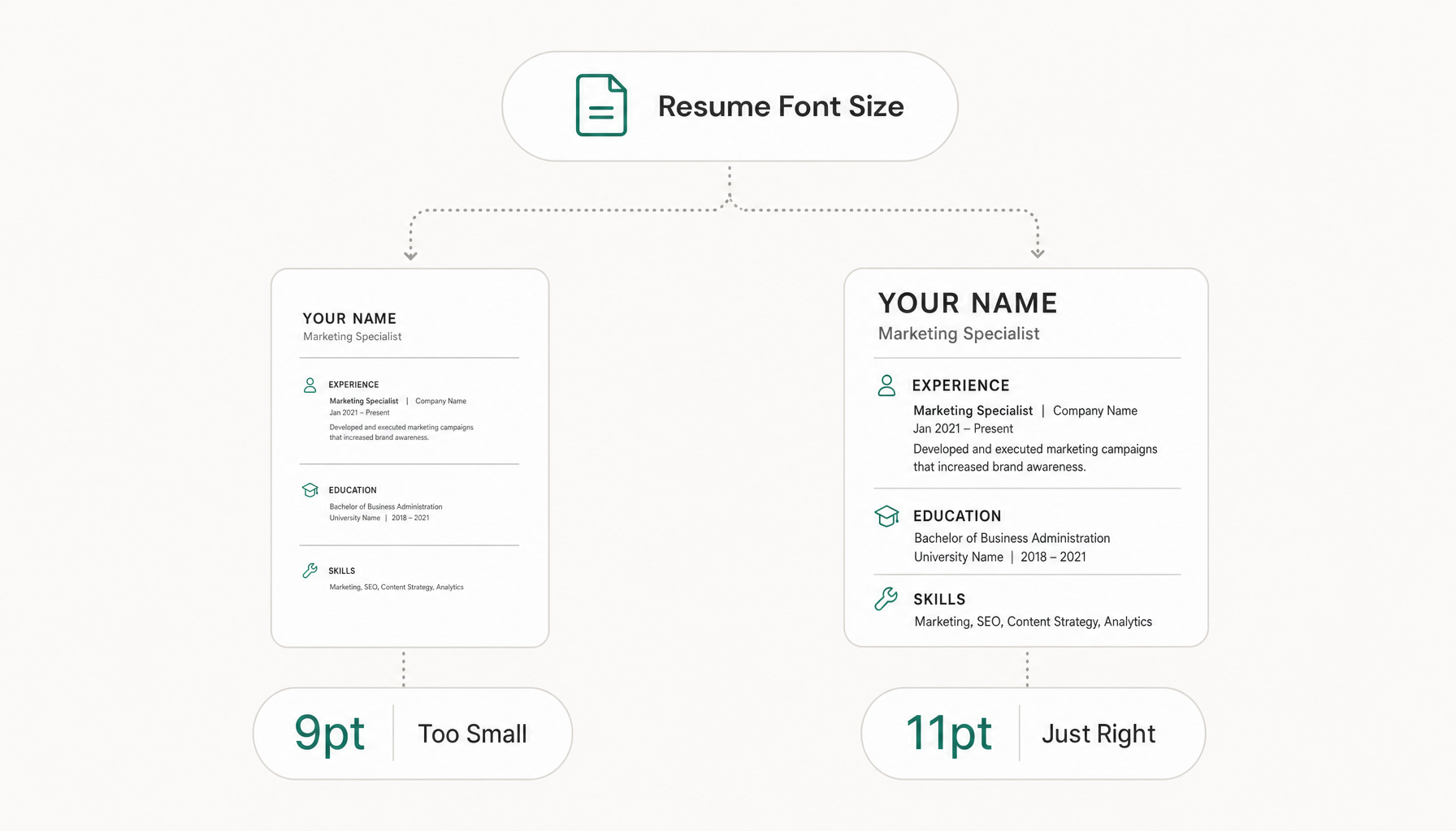
Font size matters as much as font choice. Here are the numbers that work:
- Your name: 18–22pt (the only element that should be significantly larger)
- Section headings: 12–14pt, bold
- Body text: 10.5–12pt (never below 10pt)
- Contact info: 10–11pt
The critical rule: if you're shrinking your font below 10.5pt to fit everything on one page, you have a content problem, not a formatting one. Cut weaker bullet points instead of making your resume harder to read. Check our guide on resume length if you're unsure whether to go one or two pages.
Fonts to Avoid on Your Resume (and Why They Hurt You)
Times New Roman — Not technically bad, but it signals "I didn't make a choice." It's the font of someone who opened Word and didn't change anything. Hiring managers notice.
Comic Sans — You know this. But people still do it.
Decorative/Script fonts (Papyrus, Brush Script, Impact) — ATS systems may not parse these correctly. Even if they do, recruiters will dismiss you immediately.
Courier New — Monospaced fonts waste horizontal space and look like typewriter output from 1985.
Futura — Surprisingly controversial. The geometric shapes look modern but create readability issues in dense paragraph text because characters like 'a' and 'o' become difficult to distinguish at small sizes.
Any font you downloaded from a free font website — If it's not a standard system font or a well-known Google Font, there's a real risk the ATS won't have it in its rendering library. Your beautifully designed resume becomes a wall of fallback-font rectangles.
How ATS Software Reads — and Sometimes Rejects — Your Font
Here's what actually happens when your resume enters an applicant tracking system:
- The ATS extracts the text layer from your document (PDF or DOCX)
- It maps characters using the font's encoding table
- It segments the text into fields (name, title, experience, skills)
- It searches for keyword matches against the job description
Fonts cause problems at step 2. If you've used a non-standard font that isn't embedded in your PDF, the ATS may substitute a default font — and character mapping errors can turn "managed" into "m@naged" or merge words together. I've seen resumes where an entire skills section was parsed as a single unbroken string because the font's spacing data wasn't recognized.
Stick to these ATS-safe font families and you'll never have this problem: Calibri, Arial, Garamond, Georgia, Cambria, Helvetica, Lato, Roboto, Times New Roman.
But font is only one piece of the ATS puzzle. Your formatting, keywords, and section structure matter even more. Want to see how your resume actually scores against a specific job? Paste any job description into Resume Inspector — it's free, no signup needed — and you'll see exactly which keywords you're missing in under a minute. You've handled the font; now make sure the content passes too.
Formatting Tips: Pairing Fonts, Spacing, and Hierarchy
Use one font, two weights maximum. Bold for headings, regular for body text. That's it. Two different font families on a resume looks like a ransom note.
Line spacing: Set to 1.15 or 1.2. Single-spacing cramps text; 1.5 wastes space.
Margins: 0.5" to 0.75" on all sides. Anything tighter and your resume looks claustrophobic.
Consistency is king. If your job titles are bold 12pt Calibri, every job title must be bold 12pt Calibri. One inconsistency signals carelessness — and recruiters are looking for reasons to say no.
For more on how formatting affects your chances, see our full guide on best resume format for 2026.
Quick-Reference Font Guide by Industry
| Industry | Recommended Font | Style | Why |
|---|---|---|---|
| Tech / Startups | Inter, Calibri | Sans-serif | Matches modern digital aesthetic |
| Finance / Law | Garamond, Cambria | Serif | Signals tradition and precision |
| Healthcare | Calibri, Georgia | Either | Prioritizes clean readability |
| Creative / Design | Lato, Raleway | Sans-serif | Shows typographic awareness |
| Government / Academia | Georgia, Garamond | Serif | Formal, dense-text friendly |
| General / Unsure | Calibri | Sans-serif | Universal safe choice |
When in doubt, Calibri. It works everywhere, offends no one, and every system on earth can render it.
Try our free Job Keyword Scanner to see how your resume stacks up.
Try our free ATS Resume Checker to see how your resume stacks up.
Final Checklist Before You Submit Your Resume
- Font is a standard system font or well-known Google Font
- Body text is between 10.5pt and 12pt
- Only one font family used throughout
- Bold and regular weights create clear visual hierarchy
- PDF is exported with fonts embedded (check your export settings)
- Printed a test copy to verify readability
- No decorative fonts anywhere — including headers
- Spacing is consistent between all sections
You've nailed the typography. But before you hit send, a quick ATS check can catch what a font audit can't — keyword gaps, formatting flags, and section-parsing issues that derail applications silently. Run the free analysis to see how your resume scores against the actual job description. It takes 60 seconds and requires no signup.